
Selecting the perfect paint color isn’t always as easy as picking a favorite shade. The right palette should reflect your personality, complement your furnishings, and match your space’s natural lighting. If you’re wondering how to choose paint colors for your home, you’re not alone, and you’re in the right place.
At Mayas Painting, we help homeowners in Philadelphia, PA, make smart, stylish choices for interiors and exteriors. From color psychology to accent wall ideas, this guide covers everything you need to feel confident in your next project.
Use Color Psychology to Guide Your Mood
Color is more than visual—it’s emotional. Color psychology explains how different hues influence mood and energy. For example, blues and greens promote calm and focus, while yellows and oranges spark energy and conversation. Understanding these responses helps you match colors to the mood of each room.
Bedrooms benefit from cool tones that encourage rest, while kitchens and offices might benefit from warmer tones that promote action and alertness.
Popular Paint Colors 2025 – What’s Trending
This year, popular paint colors for 2025 blend nature and nostalgia. Earthy tones like clay, olive, and mushroom are gaining popularity, offering a calm, grounded feel. Soft pastels and updated neutrals are also trending, especially in open-concept spaces.
If you’re looking for something bold, navy blue and deep green continue to be favorite accent wall ideas, adding depth and drama to otherwise neutral rooms.
Color Consulting Tips to Simplify the Process
Not sure where to start? Our professional color consulting tips can help:
- Start with fixed elements: Match paint to your existing floors, countertops, or cabinets.
- Test in real light: Paint colors change under different lighting conditions.
- Balance your palette: Mix neutrals with one or two feature colors to avoid visual overload.
Need help creating a paint palette for small rooms? Light tones open up tight spaces, while vertical stripes or accent walls add visual height and interest. When matching paint shades, it’s essential to consider undertones—pairing a warm beige with a cooler gray may create imbalance, while coordinating complementary hues ensures visual flow.
Understanding Warm vs Cool Tones
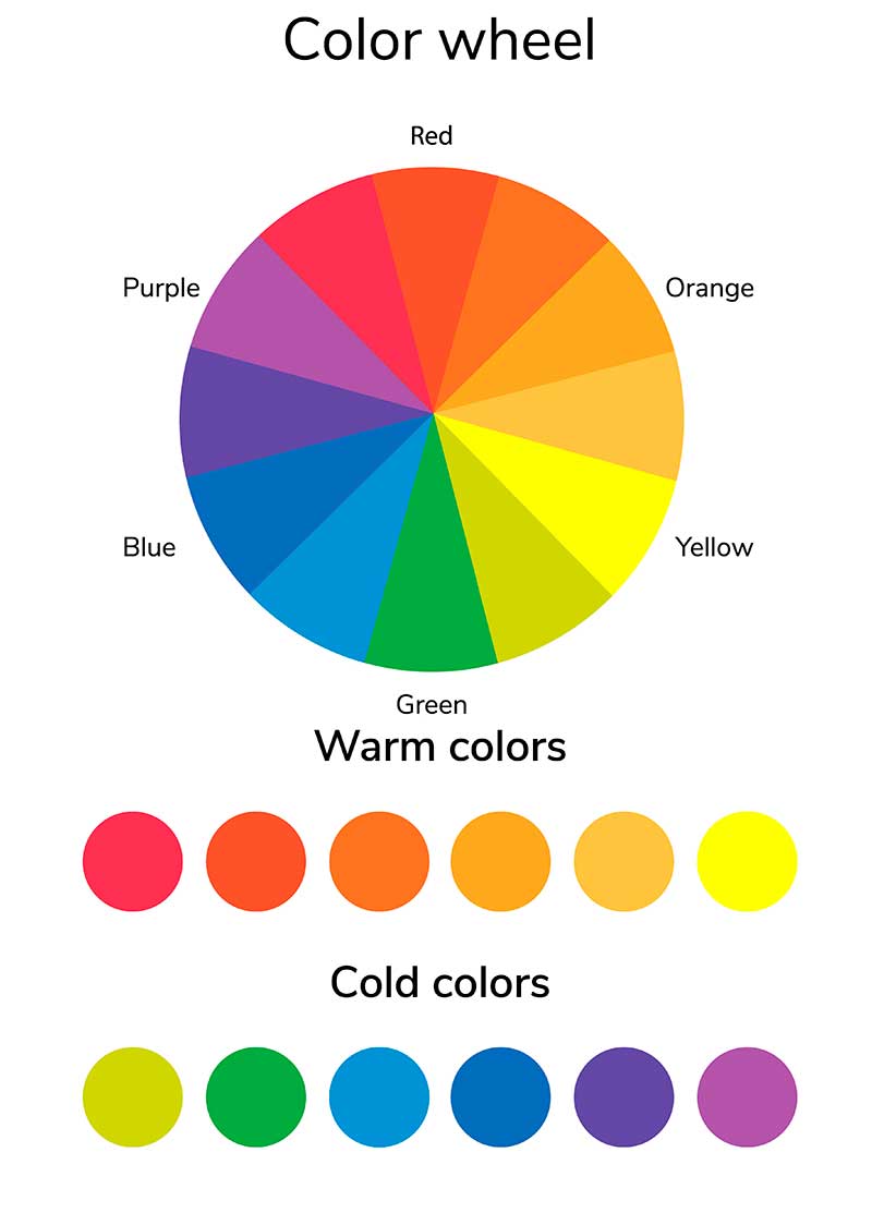
A key part of choosing paint is understanding warm vs cool tones. Warm colors (like beige, red, and yellow) tend to feel cozy and energizing. Cool colors (like gray, blue, and lavender) are calming and make spaces feel larger.
In Philadelphia’s seasonal climate, warm tones can make your home feel inviting in winter, while cool tones offer relief during humid summers.
Professional Support from Mayas Painting
At Mayas Painting, we specialize in interior painting, exterior painting, and color consulting. Whether you need guidance choosing the best interior colors or support executing your vision, our experts provide reliable, high-quality results with attention to detail.
We help you find the perfect color combination that fits your space, preferences, and long-term goals.
Conclusion – Find the Perfect Paint Colors with Confidence
Choosing the right color shouldn’t be stressful. When you know how to choose paint colors for your home, you gain more than beauty, balance, comfort, and style. Whether updating one room or repainting your entire home, let Mayas Painting help you create a space you’ll love.
Serving Philadelphia, PA
Call (267) 815-3998 or schedule your color consultation today
Frequently Asked Questions
What color should I paint a small room?
Light, neutral shades like soft gray or off-white make small rooms feel more spacious.
How do I choose between warm and cool tones?
Consider the room’s purpose, lighting, and existing furnishings. Warm tones create energy; cool tones promote calm.
Should every room in my house be the same color?
No. Use a cohesive palette with slight variations to keep the flow while giving each room its own identity.